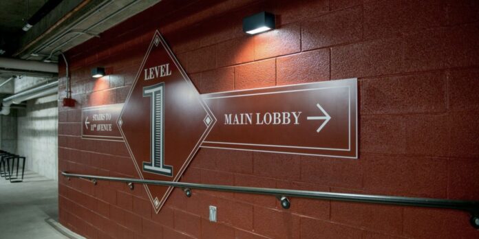
All way-finding systems, from mall signage designs to urban way-finding management, serve one purpose: to direct visitors to their destination as easily and as efficiently as possible. Signage is used to guide, instruct, and convey complex navigation information.
Inefficient use of this visual communicative tool can result in confusion, anxiety, and signage blindness. If your signage system contributes to the visual noise in its surroundings, it can cause irritations among users of your space, particularly visitors.
This can negatively affect the behavior you want to influence. If you’re a retailer, this can decrease the likelihood of a purchase. If you’re a public space like a museum or transit system, this may discourage users from returning as a repeat visitor.
To reduce or eliminate such irritants, your way-finding signage must provide a sense of place and help users confidently navigate their surrounding environment. Below reviews some necessary tips to keep in mind when developing a signage system for your built environment.
1. Clarify your signage goals
Before any elements of signage are agreed upon, survey your existing signage system. Stakeholders of the business should review existing standards and guidelines to evaluate any problem areas or perceived decision points not effectively served by existing signs.
If you’re developing a new project, on-site surveys are necessary to formulate a design direction that works within the approved budget and the established aesthetics of the environment.
Whether it’s a new or existing space, it is necessary to examine what existing elements work well and what needs to be improved upon. A way-finding design consultancy firm will assist you in addressing any existing design challenges and develop the most workable way-finding system.
2. Incorporate the right design elements
Once you’ve surveyed your space and determined decision points that enable users to make informed navigational decisions, consider the following design elements:
Contrasting colors
Certain color schemes improve the effectiveness of your signage designs. High color contrasts like black on yellow, white on blue, and white on black improve legibility and ensure users can distinguish the text displayed on the sign.
Visibility
When it comes to ensuring maximum exposure, signs must be sized appropriately according to their viewing distance. Meaning, every 1 inch of letter height allows for 10 feet of viewing distance. For example, a sign with a 3-inch letter height is readable from 30 feet away.
Readability
Typeface must be carefully chosen to display a clear message. Sans-serif fonts like Helvetica and Myriad are great typefaces as they are simplistic and easy to read. Other easy-to-read typefaces to consider include Garamond, Futura, Franklin Gothic, and Optima.
Use universal pictograms
While text is essential to conveying important information, symbol design is integral in communicating your message more concisely. And in some environments, the use of universal pictograms are more effective than words.
Having signs that are universally understood ensures your way-finding system addresses a universal communication need despite any language barriers or accessibility issues.
Park signage design like the one in Quranic Park located in Dubai makes effective use of these design elements. The park establishes a clear graphic identity, allowing users to explore the thematic message of the park’s landmarks.
3. Understand the four different way-finding signs
When it comes to way-finding signs, there are four common types and each serves a specific role in your way-finding system.
1.Identification
Typically found in destination points, identification signs denote that you have arrived at your chosen destination. Identification signs can be used to indicate entrances, exits, and interesting or as markers for common destinations like restrooms and conference rooms.
2. Directional
Directional signage are your navigational signs in planned waypoints such as junctions throughout a built environment. They indicate pathways and directions to ensure you reach your destination.
Directional signs are also used to highlight interesting locations along your destination route.
3. Informational
Informational signs are used to help users identify broad information about their surroundings rather than for navigation or to mark a specific landmark. Informational signs can include facility information like hours of operation and amenities (elevators).
4. Regulatory
To ensure the safe use of a space, built environments must display the set boundaries available to users. Regulatory signage is used to safely denote what the rules and regulations of the built environment are.
The most common regulatory signs include “No Smoking,” “Employees Only,” and Caution! High Voltage!”
Each of these wayfinding signs should be used in conjunction with one another. This will ensure that users understand the behavioral expectations of their surroundings while seamlessly transitioning between two points. visit this website
4. Keep signage simple
Signs that don’t clearly and concisely convey their message hinder their usefulness.
Over cluttered signs lend themselves to greater confusion, resulting in a negative user experience. In time, this will lead to signage blindness as users cannot cut through the information overload or visual noise.
To avoid this eventuality, use as few words as possible in your signage. As mentioned, universal pictograms can sometimes be as effective, if not more precise, in conveying your message.
As commercial spaces, from healthcare to retail, are constantly changing to meet user demand, another added benefit of keeping signage design simple is how quickly they can be changed when required.
This interchangeability will ensure you save on time and costs when it’s time for an upgrade.
5. Be consistent
While wayfinding signage serves an important directional or navigational purpose, aesthetics should not be dismissed.
When deployed properly, signage can be an effective branding tool. Incorporating your brand colors and typography to your wayfinding signs can reinforce an image of trust. Conveying consistent availability encourages a feeling of connectedness in the subconscious of consumers.
The use of common design elements helps your space achieve a common uniformity, making it easier for your business to keep your consumers engaged and use your navigational displays while simultaneously creating a lasting impression.
Consistency can also be reflected in the standardization of locations and destinations.
Using multiple names like “foyer” and “entrance hall” or “bathroom” and “restrooms” to refer to the same space can result in confusion among your consumers. Maintain consistency by agreeing to a set of terminology before developing your wayfinding system.
Conclusion
It may seem pretty straightforward, but wayfinding signage can be incredibly complex. Developing a useful wayfinding system that encourages interaction is a balancing act.
Whether you’re looking to upgrade your wayfinding system in an existing space or looking to develop brand new custom wayfinding signage, consider working with a wayfinding design consultancy firm.
Their expertise and technical know-how will help you streamline the design process, allowing you to create a wayfinding solution that visitors are more than happy to interact with.


